
Power BI Dashboard
IT Support Ticket Performance Dashboard
An interactive business intelligence dashboard built to analyze IT support ticket volume, SLA compliance, resolution performance, priority trends, and regional service activity.
View Live DashboardProject Overview
This dashboard was designed to evaluate IT support ticket performance through a clean, executive-ready Power BI report. It brings together key service metrics such as total tickets, open tickets, average resolution hours, SLA compliance, priority levels, SLA plan performance, and regional trends.
Business Problem
IT support teams need a clear way to monitor service performance, identify ticket bottlenecks, and understand whether support activity is meeting SLA expectations. Without a centralized dashboard, it becomes harder to quickly spot delays, compare performance across categories, and communicate operational issues to stakeholders.
Tools Used
- Power BI
- DAX
- Power Query
- Excel / CSV Data Cleaning
- Data Modeling
- Dashboard Design
- Operational Analytics
Key Features
- KPI cards for total tickets, open tickets, SLA compliance, and resolution hours
- Ticket trend analysis over time
- SLA compliance breakdown by service plan
- Priority-level ticket performance analysis
- Regional filtering and performance comparison
- Clean executive-style insight summary section
Dashboard Insights
The report helps identify which ticket priorities and SLA plans are driving service delays, where support volume is concentrated, and how resolution performance changes over time. It provides stakeholders with a fast way to evaluate support health and understand where operational improvements may be needed.
Business Value
This project demonstrates how business intelligence can turn raw support ticket data into actionable operational insight. The dashboard helps improve visibility, supports faster decision making, and gives leadership a professional reporting tool for tracking service performance.
NBA Player Impact & Value Analytics Platform
This project evaluates NBA player performance through a custom Impact Score model that combines per-36 production, efficiency, advanced metrics, and salary value. What began as a player comparison dashboard evolved into an automated analytics platform built around Python, Azure, Power BI, DAX, and Power Query.
The project demonstrates end-to-end business intelligence development, including data extraction, cleaning, cloud storage, workflow automation, KPI modeling, dashboard design, and scalable reporting architecture.
Project Overview
Built an interactive Power BI dashboard that evaluates NBA players using custom performance metrics, salary efficiency analysis, and playoff trend reporting.
Business Problem
Traditional box score statistics do not fully explain player value. This project creates a more balanced KPI model that connects performance, efficiency, role, and contract value.
Tools Used
- Power BI
- DAX
- Power Query
- Python Data Cleaning
- Azure Blob Storage
- Azure Data Factory
Key Features
- Custom Impact Score model
- Salary value comparison
- Per-36 production normalization
- Efficiency and advanced metric adjustments
- Automated refresh workflow
Dashboard Insights
The dashboard highlights players who deliver strong production relative to salary, separates high-volume performance from efficient impact, and helps identify underrated contributors.
Business Value
Although the subject is basketball, the project mirrors real business reporting environments by showing workflow automation, cloud integration, KPI modeling, and scalable dashboard delivery.
Process & System Design
Beyond the dashboard, this project focused on workflow optimization, ETL automation, cloud orchestration, and repeatable reporting architecture.
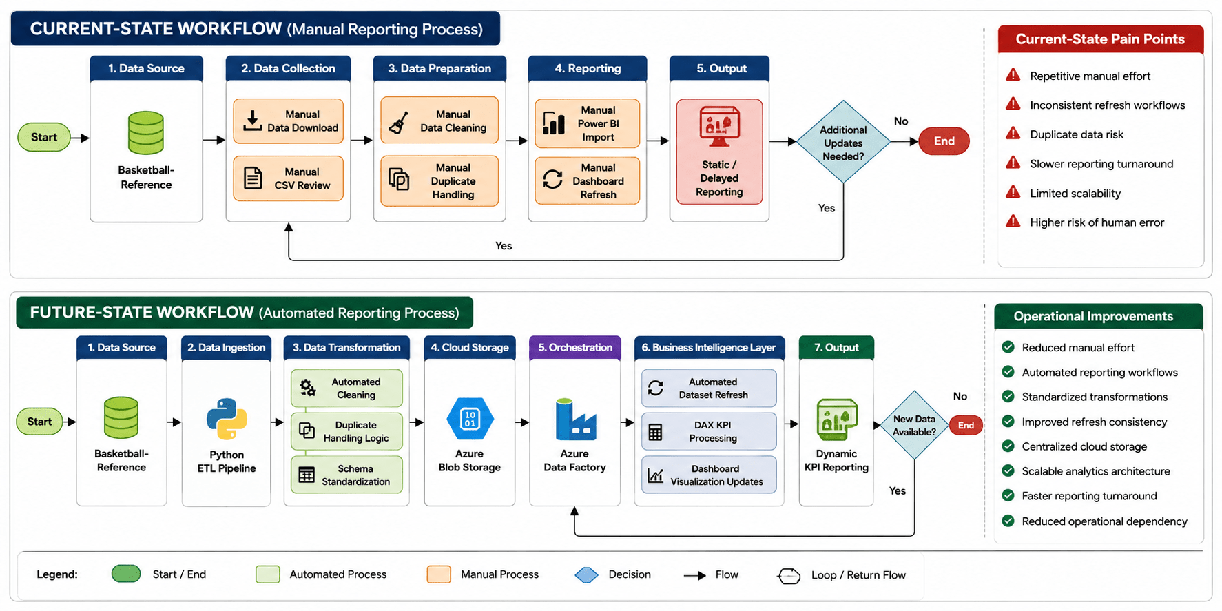
Current-State vs Future-State Workflow
Redesigned a fragmented manual reporting process into a standardized, automated analytics workflow.
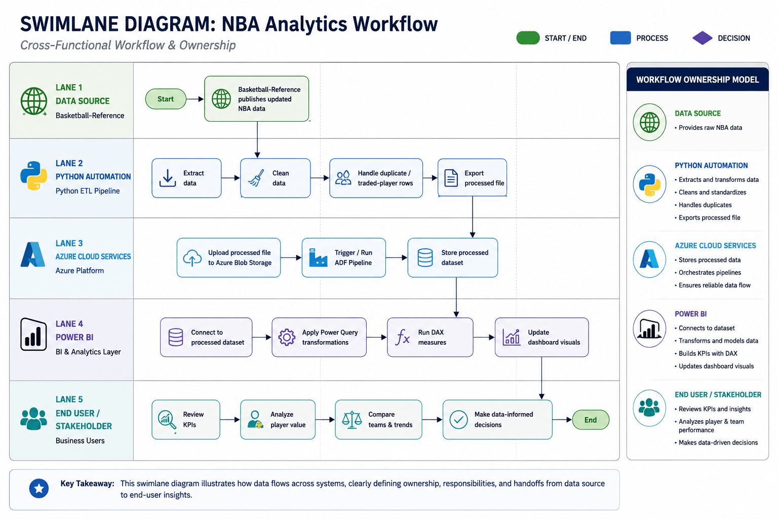
Cross-Functional Workflow Ownership
Shows how data moves across systems, automation tools, cloud infrastructure, and reporting environments.
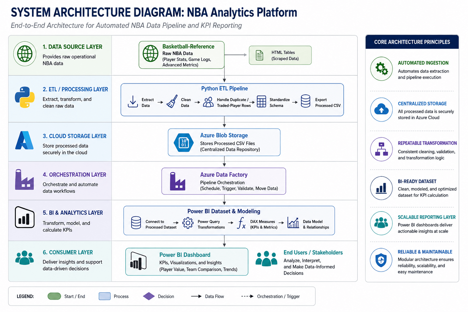
Cloud-Integrated Analytics Architecture
Connects Python ETL, Azure Blob Storage, Azure Data Factory, Power BI modeling, and KPI reporting.
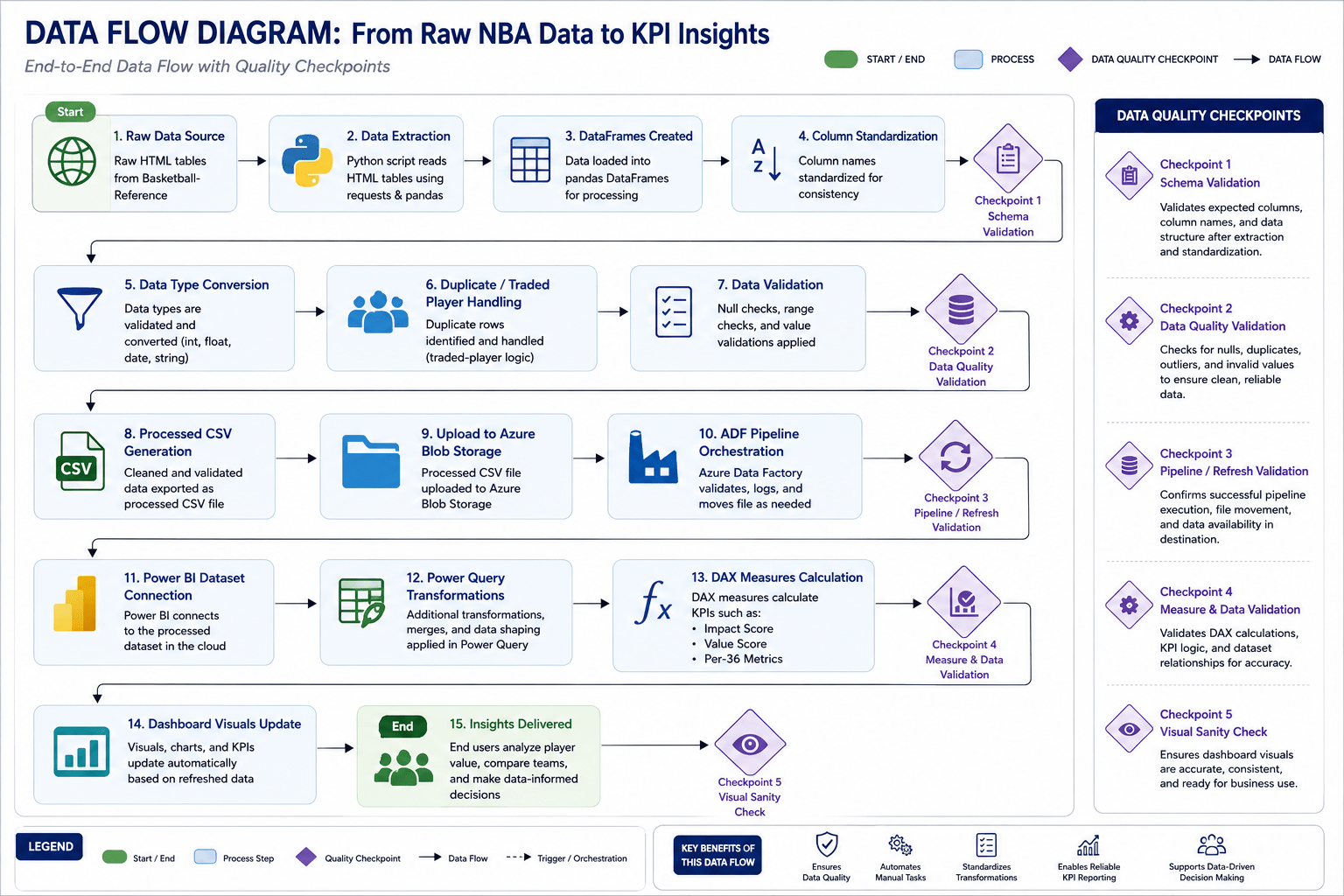
End-to-End Data Transformation Lifecycle
Automates ingestion, validation, transformation, dashboard refresh, and reporting consistency.
Key Business & Technical Outcomes
• Standardized workflow logic
• Automated refresh lifecycle
• Improved reporting consistency
• Implemented ETL automation
• Centralized processed datasets
• Improved operational reliability
• Applied process optimization
• Created KPI-driven reporting
• Built scalable BI infrastructure